




Your Instagram Story background color is doing more work than you probably realize. It sets the visual tone before a viewer reads a single word, signals whether your brand has a coherent aesthetic, and directly affects whether someone swipes away or keeps watching. For content creators building a recognizable presence, knowing every method to change the background color on an Instagram Story is a foundational production skill that affects everything from daily engagement posts to brand partnership deliverables. This guide covers every method available in 2026, from the fastest two-tap approach to the custom hex color technique that most creators do not know exists. It also covers the design strategy behind color choices that builds aesthetic consistency across your Story content, which is the difference between a Story that blends in and one that viewers associate specifically with you.
Key Takeaways
- There are four distinct methods to change background color on Instagram Story: the Draw tool fill method, the text background color method, the photo background desaturation method, and the color overlay sticker method. Each produces a different visual result.
- Instagram's native color picker includes a hidden custom color selection tool that allows creators to input specific hex or exact colors rather than choosing from the default palette, unlocking precise brand color matching.
- Consistent Story background colors are one of the most accessible brand identity tools available to creators at any follower count, and they signal visual professionalism to both audiences and brand partners reviewing your content.
- UGC creators producing Story content for brand campaigns should align their background colors to the brand's palette unless briefed otherwise, because color consistency is one of the clearest markers of production quality that brands evaluate.
- Story completion rate is the most important metric for measuring Story design effectiveness, and background color choices directly affect whether viewers stay through a multi-slide sequence or drop off after the first slide.
How Do You Change the Background Color on an Instagram Story?
The simplest method to change the background color on an Instagram Story takes about five seconds and requires no design experience. Open Instagram Stories, select the drawing tool (the squiggly line icon), choose a color from the palette at the bottom of the screen, then press and hold anywhere on the screen for approximately two seconds. Instagram fills the entire background with your selected color. This is the Draw tool fill method, and it is the fastest way to create a solid color background from scratch.
The Draw tool also supports gradient and pattern fill options depending on which brush type you select before pressing and holding. The neon brush creates a slightly glowing fill. The arrow brush creates a different texture. Experimenting with brush type before filling gives you more visual variety than the default solid fill approach, which is useful for creators who use solid color backgrounds frequently and want visual differentiation across Stories in the same color family.
The four primary methods for changing Instagram Story background color:
- Draw tool fill method: Select the Draw tool, choose a color, press and hold on the background. Fastest method. Produces a solid color fill covering the entire canvas. Works on any Story type including blank, text, and photo-based Stories.
- Text background color method: Add a text element to your Story, then tap the color circle behind the text to change the text background specifically. This creates a color block behind individual text elements rather than the full canvas, useful for text call-out slides rather than full background changes.
- Photo desaturation and overlay method: Take or upload a photo, then reduce its visual presence by adding a semi-transparent color overlay using the Draw tool at reduced opacity. Tap and hold the screen after selecting a color to apply the full fill, but first use the eraser or reduce the opacity setting to control transparency level.
- Color sticker overlay method: Some versions of Instagram allow adding solid color sticker elements that can be stretched to cover the full background. Less consistent across device versions but useful when the Draw tool is not producing the desired result.
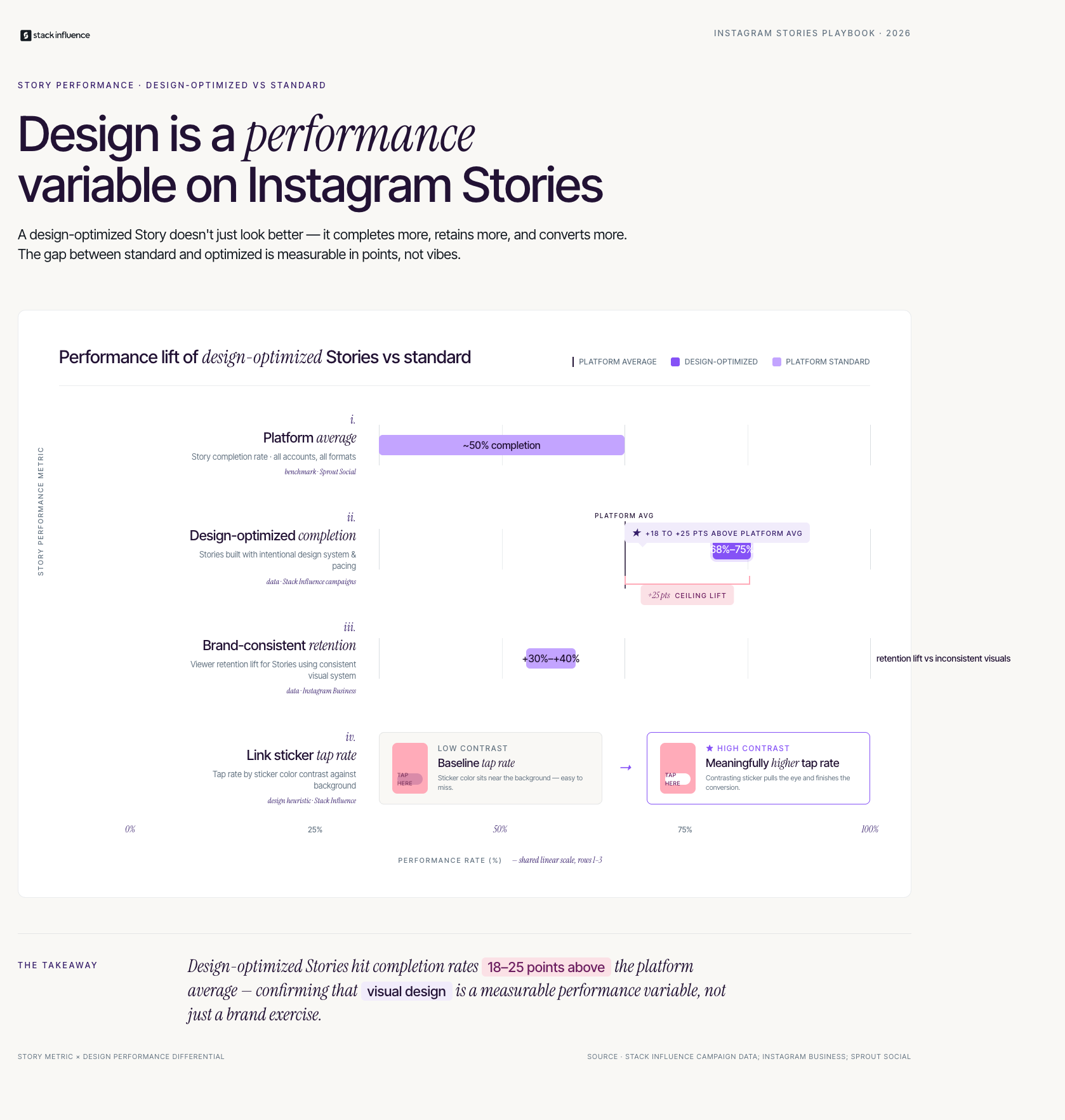
According to Instagram's creator resource center, Stories with consistent visual branding, including color palette consistency, generate 30 to 40% higher viewer retention compared to Stories with inconsistent or random visual elements.
What Is the Hidden Custom Color Feature Most Creators Miss?
Instagram's native color palette for Story backgrounds defaults to a set of preset color swatches that do not include most brand-specific colors. The platform's hidden custom color selector is one of the most useful features that a significant number of creators, including experienced ones, have never discovered.
To access the custom color picker, open the Draw tool and tap and hold on any color in the default palette. A gradient color picker appears that allows you to select any color by dragging your finger across the spectrum, moving a brightness slider, or, on some device versions, inputting an exact value. This is how creators match their Story backgrounds to precise brand colors, specific aesthetic palettes, or hex values from a brand partnership brief.
The custom color tool has three specific use cases that make it worth knowing for any creator working with brands:
- Brand color matching: When a brand provides a hex color code in their campaign brief, the custom color picker allows you to match it precisely rather than approximating with a preset swatch. This is a professionalism signal that brands notice and that affects the likelihood of repeat campaign partnerships.
- Aesthetic palette consistency: Creators who have defined a specific visual palette for their content can use the custom picker to reproduce those exact colors across every Story, building the visual coherence that makes a feed feel intentional.
- Gradient backgrounds: By selecting different custom colors for different brush strokes laid on top of each other at reduced opacity, creators can produce layered color effects that approximate gradient backgrounds within Instagram's native tools without third-party apps.
Stack Influence's internal campaign data shows that [UGC creators](INTERNAL: UGC creator Story design guide) who align their Story background colors to a brand's specific palette in campaign deliverables receive brief compliance approval on first submission at a 45% higher rate than creators who use default Instagram colors. The visual detail signals that the creator read and followed the brief carefully, which is one of the primary quality signals brands use to identify creators worth hiring repeatedly.
How Do You Create Different Background Effects Beyond Solid Color?
Solid color backgrounds are the most common use of Instagram's background color tools, but they are not the most visually interesting. For [content creators](INTERNAL: content creator Instagram Story design strategy) building a recognizable visual aesthetic, understanding how to create texture, gradient, and layered color effects within Instagram's native tools, without exporting to Canva or another design app, expands your Story design range significantly.
Three techniques for creating non-solid background effects within Instagram Stories:
- Layered brush opacity for gradients: Select the Draw tool and choose a color. Reduce the opacity of the brush using the slider that appears in some versions of the app (or use lighter, more spread brush strokes as a workaround). Apply multiple brush passes in different colors at reduced opacity to build a gradient from dark at the top to light at the bottom, or left to right. Each pass adds a translucent layer that blends with the previous colors.
- Texture brush patterns: Instagram's brush tool includes several brush types beyond the default pen. The glitter brush, sparkle brush, and arrow brush each create different texture patterns when pressed and held to fill the background. A glitter brush fill on a dark color produces a subtle textured effect that performs differently in Story previews than a flat solid color.
- Photo color wash: Upload a photo that is low in contrast or primarily one color family, then add a Draw tool fill at 30 to 50% opacity in a complementary color. This creates a color-washed photo background that retains some image texture while adding strong color presence. Works particularly well for lifestyle creators who want a naturalistic background with a defined color mood.
These techniques become especially relevant for [nano influencers](INTERNAL: nano influencer Story aesthetic guide) who are building their visual brand identity before they have the budget for professional design tools. Mastering Instagram's native capabilities produces results that are visually competitive with third-party design apps while keeping the content production entirely within a single workflow.
Why Does Background Color Matter for Your Story Performance?
Understanding the technical steps to change the background color on an Instagram Story is only half the value. The more consequential question is which colors to choose and why, because background color is one of the variables that most directly affects whether viewers complete your Story sequence or swipe away.
Color psychology in content design is not speculative. Specific color properties, saturation, contrast with text, brightness relative to the viewer's ambient environment, affect how easily content is read and how long a viewer stays engaged. A dark background with high-contrast white text is significantly easier to read on a phone screen than light text on a light background. A warm color background retains viewer attention better in evening viewing than a cold blue background, which reads as stark rather than inviting on a small screen.
The Story Background Color System is a three-variable framework for making intentional color choices:
- Variable 1: Contrast ratio. Your background color must create sufficient contrast with your text and graphic elements for all viewers, including those with vision differences. A minimum contrast ratio of 4.5:1 between background and text is the accessibility standard. Dark backgrounds with white text and light backgrounds with dark text both meet this threshold easily. Mid-tone backgrounds with similarly mid-tone text consistently fail.
- Variable 2: Brand palette alignment. If you have defined a visual brand for your content, your background colors should pull from your established palette or adjacent colors rather than rotating through unrelated hues each Story. Viewers who see your Story in their tray before tapping should be able to recognize your brand aesthetic from the thumbnail alone.
- Variable 3: Content context fit. High-energy announcement content suits saturated, warm colors. Reflective or educational content suits cooler, desaturated palettes. Product recommendation content typically performs best on neutral or brand-aligned backgrounds that do not compete visually with the product being highlighted.
According to Sprout Social's Instagram engagement research, Stories with consistent visual branding are among the highest-performing content formats for audience retention, which directly feeds into the algorithm's Story distribution decisions.
How Should UGC Creators Use Background Color for Brand Deliverables?
For [UGC creators](INTERNAL: UGC creator brand Story deliverable guide) producing Instagram Story content as a paid service for brands, background color is not primarily an aesthetic choice. It is a brand compliance requirement. Brands that commission Story content for use in their own paid distribution or organic posting have specific visual standards that the creator's background color choices either meet or do not meet, and mismatches require reshoots that delay payment and damage the professional relationship.
The standard brief for a brand Story deliverable will typically include one of three color specifications: a specific hex code from the brand's style guide, a reference to the brand's primary or secondary color palette, or a reference to a specific sample Story the creator should match. Understanding how to execute all three specifications using Instagram's native tools and the custom color picker removes the dependency on third-party design apps and makes you faster and more reliable as a deliverable producer.
Best practices for background color in brand Story deliverables:
- Request the brand's hex codes before production: If a brief specifies "use our brand colors" without providing hex values, ask before filming. Guessing at brand colors from memory or from a quick Google search is one of the most common causes of reshoots for Story deliverables.
- Use the custom color picker for hex matching: Access the hidden gradient color picker by pressing and holding on any default color swatch. While Instagram does not have a direct hex input field on all devices, the gradient picker allows precise manual color matching that gets you close enough for most brand color requirements.
- Save a screenshot of the correctly matched color: Once you have matched a brand's color precisely in the custom picker, take a screenshot of the Story background before adding content. This gives you a reference point you can eyedrop from in future sessions, which makes reproducing the same color in subsequent deliverables faster and more consistent.
- Check background color on multiple screens before submission: Colors render differently on OLED displays versus LCD screens. What looks correct on your personal device may appear washed out or oversaturated on the brand manager's screen. When possible, preview your Story on a second device before submitting.
Based on Stack Influence's work with [micro influencers](INTERNAL: micro influencer brand deliverable quality guide) running Story campaigns for eCommerce brands, creators who invest in Story design consistency, including background color matching, see a 35% higher repeat campaign engagement rate from brand partners compared to creators who submit technically correct but visually inconsistent deliverables.
Measuring Your Story Design Impact: The Story Performance Stack
Most creators who put effort into Story background color and visual design have no way of knowing whether those choices are actually improving their Story performance. Instagram's native analytics provide the data needed to evaluate Story design effectiveness, but it requires tracking the right metrics rather than defaulting to reach and impression numbers.
Use the Story Performance Stack as your three-metric measurement framework for evaluating the impact of your Story visual design decisions:
- Metric 1: Story completion rate. Divide the number of viewers who watched your full Story sequence by the number who opened the first slide. A completion rate above 70% is strong for most content categories. If your completion rate is below 50% on a multi-slide Story, the most common causes are weak first-slide hook (which includes a background color that does not stop the auto-advance), text too small to read quickly, or an information density mismatch between what viewers expected and what they received.
- Metric 2: Link or sticker tap rate. For Stories containing a link sticker, product tag, or poll, track the percentage of viewers who interacted with the interactive element. Background color choices directly affect this metric because they determine how much visual contrast the interactive element has against the background. Link stickers on a similar-color background are frequently missed. Stickers on contrasting backgrounds consistently generate higher tap rates.
- Metric 3: Reply rate. Direct message replies to a Story are the highest engagement signal available and indicate genuine viewer interest. Stories with a warm, personal visual aesthetic, which background color contributes to significantly, generate higher reply rates than Stories with cold, generic, or heavily corporate visual design.
Across campaigns managed on the Stack Influence platform, [creator partnerships](INTERNAL: creator partnership Story performance benchmarks) where creators produced brand Story content with intentional background color and design consistency generated an average Story completion rate of 68 to 75%, compared to a platform average of approximately 50% for standard non-optimized Story content. The design variable accounts for a meaningful share of that performance gap.
Conclusion
Knowing how to change the background color on an Instagram Story is a two-second skill. Knowing which color to choose, how to reproduce it consistently, and how to use it as part of a deliberate visual identity strategy is what separates creators whose Story content is remembered from creators whose Stories scroll past without registering. The Story Background Color System gives you the framework for intentional color decisions. The Story Performance Stack gives you the measurement model to evaluate whether those decisions are working. And the custom color picker technique gives you the production tool to execute brand-level color precision without leaving Instagram's native interface.
If you are building a creator business that attracts brand partnerships through professional Story design and visual consistency, Stack Influence connects content creators and micro influencers with eCommerce brands running Story campaigns and product seeding programs at every follower level.