




Content creators rarely lack data. Instagram, TikTok, YouTube, affiliate programs, brand portals, and storefronts all produce numbers. The real problem is turning those disconnected numbers into decisions. A social media analytics dashboard should show what to repeat, what to stop, how your audience is changing, and whether attention is becoming income.
This guide explains how to build a creator-first dashboard that supports content planning, audience growth, brand deals, UGC work, affiliate revenue, and long-term creator partnerships. The goal is not to collect every available metric. It is to create a compact decision system you will actually use.
Key Takeaways
- Track metrics that change a decision, not every number a platform provides.
- Organize performance through five layers: exposure, attention, resonance, action, and commercial proof.
- Compare posts within the same platform, format, age, and distribution type before comparing raw totals.
- Keep creator performance, campaign delivery, and attributed business outcomes separate.
- Every reporting period should end with one insight, one hypothesis, and one next test.
What Is a Social Media Analytics Dashboard?
A social media analytics dashboard is a recurring view of the metrics that help a creator evaluate content, audience growth, traffic, and income. Unlike a one-time campaign report, a dashboard updates over time and should make the next decision obvious, such as which format, topic, hook, platform, or partnership deserves more effort.
Understanding what social media analytics are is the foundation, but a dashboard is the operating interface. It may be a spreadsheet, a visual report, or connected software.
Native analytics should remain the source of truth for platform-specific performance. Instagram Insights helps creators evaluate followers and content performance, TikTok Studio provides content management and performance insights, and YouTube Analytics separates reach, engagement, audience, revenue, and trend information. A creator dashboard brings selected signals from those systems into one repeatable view.
A dashboard is also different from a sponsor recap. Your internal dashboard helps you make decisions every week. A creator-focused social media analytics report template packages selected results for a brand after a campaign, usually with deliverables, audience fit, performance, commercial signals, and recommendations.
The Creator Signal Stack
The Creator Signal Stack prevents a common reporting mistake: treating likes, views, clicks, and revenue as if they describe the same thing. They represent different stages of performance. A useful dashboard keeps five signal layers visible so a creator can diagnose where a post succeeded, where it stalled, and what to test next.
Exposure
Exposure shows whether content was distributed. Track reach, impressions, views, and the percentage of viewers who were followers versus nonfollowers when available.
Do not treat reach and impressions as interchangeable. Reach usually reflects unique accounts, while impressions or views can include repeated exposure.
Attention
Attention shows whether people stayed long enough to receive the idea. Track average watch time, completion rate, retention at key moments, and early drop-off for video.
TikTok defines video completion rate as completed views divided by total views, while YouTube provides average view duration and audience-retention reporting. Those metrics are more useful than views alone because a strong hook with weak retention requires a different fix from weak initial distribution.
Resonance
Resonance shows whether the content felt useful, relatable, entertaining, or worth passing along. Track saves, shares, meaningful comments, replies, and engagement rate.
Likes can still provide context, but saves and shares often carry more diagnostic value for tutorials, product demonstrations, checklists, and opinion content. Read the comments as qualitative data too.
Action
Action shows whether viewers moved closer to a relationship or purchase. Track profile visits, follows, website clicks, email signups, affiliate-link clicks, code uses, and conversions where attribution is available.
Use actions that match the post’s purpose. A discovery video may be successful because it creates profile visits and follows, while a product review may be judged by outbound clicks and attributed orders.
Commercial Proof
Commercial proof shows whether creator activity is becoming a durable business. Track sponsored revenue, affiliate revenue, platform payouts, UGC fees, repeat brand deals, approved assets, renewal rate, and revenue per production hour.
For UGC creators, commercial proof may exist even when the content never appears on the creator’s own account. Asset acceptance, revision rate, delivery speed, licensing value, and repeat briefs can matter more than follower growth.
The best version of the Creator Signal Stack uses one primary metric and no more than two diagnostic metrics per layer. A compact dashboard makes weak links in the performance chain easier to see.

Which Metrics Belong on a Creator Dashboard?
A creator dashboard should include a small set of raw totals, normalized rates, benchmarks, and commercial outcomes. At minimum, track exposure, retention, high-intent engagement, audience growth, tracked traffic, and revenue. Add metrics only when they answer a recurring question or support a sponsor, affiliate, or content decision.
Use formulas that preserve context:
- Engagement rate by reach: Total interactions divided by reach, multiplied by 100.
- Save rate: Saves divided by reach, multiplied by 100.
- Share rate: Shares divided by reach, multiplied by 100.
- Follower conversion rate: New followers divided by profile visits, multiplied by 100, when both values are available for the same period.
- Tracked click-through rate: Tracked link clicks divided by the chosen exposure denominator, multiplied by 100.
- Revenue per 1,000 views: Attributed revenue divided by views, multiplied by 1,000.
- Content efficiency: Revenue or qualified leads divided by production hours.
Always label the denominator. “Engagement rate” may mean interactions divided by followers, reach, impressions, or views, depending on the platform or tool.
Use medians alongside averages. One viral post can make a month’s average look healthy even when most content declined. A rolling median for the last 10 to 20 comparable posts gives a more honest baseline for pitches, forecasting, and experimentation.
How Do You Build a Social Media Analytics Dashboard?
Build a social media analytics dashboard by defining the decisions first, standardizing the data, collecting only necessary metrics, and adding a written interpretation layer. A creator can begin with native exports and a spreadsheet, then move to automated visualization once manual updates become frequent, slow, or error-prone.
- Write the decision before the metric. Start with questions such as “Which short-form topic earns the most saves?” or “Which platform drives the most affiliate revenue per hour of work?” The answer determines the data you need.
- Set comparison rules. Choose a fixed post age, such as seven-day performance, and separate Reels, Stories, TikToks, Shorts, long-form video, carousels, and livestreams. Also separate organic, sponsored, affiliate, and boosted distribution.
- Create a data dictionary. Record the source, exact metric name, formula, denominator, time window, content type, and date pulled. This prevents a “view” on one platform from being silently treated as identical to a “view” somewhere else.
- Build one clean data sheet. Use one row per post or asset. Helpful columns include publish date, platform, format, topic, hook type, duration, sponsor, reach, views, watch time, saves, shares, comments, clicks, conversions, revenue, production hours, and notes.
- Add off-platform tracking. Google’s campaign URL builder guidance explains how UTM parameters identify source, medium, and campaign data in Google Analytics. Use consistent naming for affiliate links, newsletters, storefront traffic, and brand campaigns so a post can be matched to downstream action.
- Visualize only recurring questions. A spreadsheet may be enough at first. Looker Studio’s report tutorial shows how to connect a data source and build visual reports, which can be useful once your sheet is structured and stable.
- Add the decision layer. Every weekly or monthly review should record three fields: observation, hypothesis, and next test. “Tutorials had a higher save rate” is an observation. “The step-by-step structure increases utility” is a hypothesis. “Publish two tutorials with different hooks” is the next test.
A practical secondary structure is the Three-View Dashboard. The Content Lab tab supports weekly creative decisions, the Audience Asset tab tracks who is joining and returning, and the Commercial Proof tab records revenue, campaign delivery, UGC assets, and partner outcomes.
How Should Creators Compare Performance Across Platforms?
Creators should compare performance within the same platform and content format before making cross-platform judgments. Use consistent post ages, normalized rates, and rolling medians. Cross-platform totals can inform resource allocation, but they should not be blended into one score because networks define views, reach, retention, and engagement differently.
Apply five comparison rules:
- Compare Shorts with Shorts, Reels with Reels, and long-form videos with similar-length videos.
- Measure every post at the same age, such as 24 hours, seven days, and 30 days.
- Separate paid or boosted distribution from organic distribution.
- Compare rates and revenue efficiency, not just raw reach.
- Keep sponsored, affiliate, and editorial content in separate benchmark groups.
YouTube’s own analytics guidance recommends comparing similar formats because audience behavior differs across videos, Shorts, and live content. The same principle belongs in a multi-platform creator dashboard: normalize the context before interpreting the result.
Never add followers from multiple platforms and call the total “unique audience.” The same person may follow you in several places. Report channel audiences separately unless you have a reliable deduplication method.
Turning Analytics Into Brand-Deal Proof
Creator analytics becomes commercially useful when it explains value in a format a brand can act on. A sponsor does not need your entire internal dashboard. It needs a clean view of what was delivered, who the content reached, how the audience responded, what action occurred, and what should happen next.
A strong sponsor view includes:
- Campaign basics: Brand, product, platform, format, publish date, and required deliverables.
- Audience fit: Relevant location, age, interests, or niche alignment where the platform provides it.
- Performance versus baseline: Sponsored-post results compared with the creator’s median for similar content.
- High-intent behavior: Saves, shares, substantive comments, clicks, code use, and attributed conversions.
- Asset details: Final files, approval status, usage rights, and any additional UGC deliverables.
- Recommendation: One evidence-based idea for a follow-up post, hook, format, or creator partnership.
The same structure strengthens influencer marketing KPI discussions and improves content tracking across longer campaigns. It also gives creators stronger evidence when applying the brand deal tactics used by small creators.
Managed campaign workflows add an operational layer to the dashboard. Stack Influence is built around gifted-first product seeding, vetted micro-influencer activation, creator coordination, UGC generation, and completed-post accountability for ecommerce campaigns.
The creator’s post metrics still explain audience response, while campaign systems track participation, deliverables, and completion.
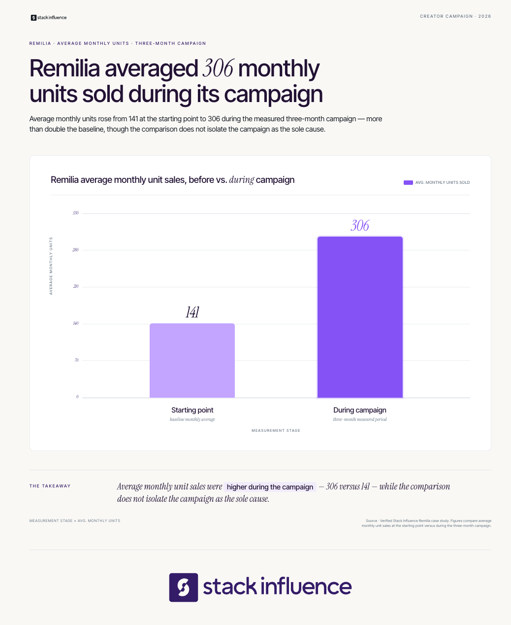
During a three-month Stack Influence campaign for Remilia, 115 creator promotions recorded 1.66 million social impressions and 73,832 engagements. Over the same measured period, average monthly unit sales moved from 141 to 306 and Amazon Best Seller Rank moved from #78,412 to #49,807.
These aggregate results do not prove that any individual post caused the marketplace changes. They show why delivery, audience response, and business outcomes should remain separate dashboard layers. Results vary by product, category, pricing, market conditions, creative quality, and execution.
Creators producing content for a brand’s channels should also document non-public value. The content creator’s guide to UGC marketing explains why UGC work is often evaluated through asset performance and commercial use, while guidance on getting brand deals on TikTok and Instagram shows how affiliate, ambassador, and content-only work can build a track record.
Ask brands for performance feedback when possible, but never invent results you cannot access.
Which Dashboard Setup Should You Choose?
Choose native analytics when you manage few channels, a spreadsheet when you need custom formulas and low-cost control, and connected software when recurring exports consume too much time. The right setup depends on channel count, reporting frequency, historical access, sponsor requirements, collaboration needs, and whether you must connect social activity to web or revenue data.
Native Platform Dashboards
Native dashboards provide the closest view of platform-specific metrics and usually require no additional software. They are practical for creators who publish on one or two channels and can review each platform separately.
The tradeoff is fragmentation. Native dashboards rarely create one consistent multi-platform history, and export options, date ranges, metric names, and retention windows can differ.
Spreadsheet and Looker Studio
A spreadsheet gives creators full control over calculations, tags, benchmarks, and commercial data. It is especially useful when affiliate income, UGC fees, sponsorships, platform payouts, and production hours must sit beside social metrics.
The tradeoff is maintenance. Manual exports and copy-paste workflows can create stale data or entry errors, so the sheet needs a fixed update routine and validation rules.
Connected Analytics Software
Connected tools reduce collection work and make cross-network reporting easier. Hootsuite Analytics combines major networks and report exports, Buffer Insights focuses on cross-channel performance and creator-friendly takeaways, and Sprout Social analytics supports customizable, shareable dashboards and deeper reporting workflows.
The tradeoff is that third-party tools depend on the data and refresh schedules available from each network. Before choosing one, verify supported accounts, post-level history, export formats, formula controls, attribution connections, data latency, and whether you can retain your own historical dataset.
Hootsuite, for example, notes that refresh timing varies by network because third-party dashboards rely on native platform updates.
A Practical Review Cadence
A dashboard works best when each review has a different job. Checking everything every day encourages overreaction, while checking only once a quarter hides useful patterns.
- After 24 hours: Check delivery problems, early retention, broken links, and unexpected audience response.
- After seven days: Record comparable post performance and classify the content by topic, format, hook, and goal.
- Weekly: Review the last several posts, identify one pattern, and choose one controlled experiment.
- Monthly: Compare rolling medians, audience growth, traffic, revenue mix, and production efficiency.
- At campaign close: Build a sponsor-ready report after the agreed measurement window and save the final assets and rights information.
Do not change strategy because one post underperformed. Look for repeated movement across comparable posts, then test one variable at a time. The dashboard should reduce emotional decision-making, not create more of it.
Common Dashboard Mistakes
The most damaging dashboard errors are usually structural rather than technical:
- Tracking vanity metrics without linking them to a content or business decision.
- Mixing platforms, formats, and post ages in the same benchmark.
- Using “engagement rate” without naming the denominator.
- Treating one viral post as normal performance.
- Combining organic and paid distribution.
- Reporting attributed sales as proof of total causal impact.
- Ignoring UGC delivery, revisions, rights, and repeat work.
- Filling the screen with charts but omitting the next action.
A useful dashboard is not the one with the most widgets. It is the one that helps a creator make a better decision faster and explain that decision to a brand, collaborator, or future self.
Build a Dashboard That Changes Your Next Move
A social media analytics dashboard should function as a creator’s decision system, not a museum of past numbers. Start with the Creator Signal Stack, establish a 30-day baseline, and add only the metrics that improve content, audience, partnership, or revenue choices.
Use the first version in your next weekly review and your next brand pitch. Over time, the dashboard becomes evidence of creative judgment, audience understanding, reliable delivery, and commercial value, which is far more useful than follower count alone.