




Amazon storefront examples are most useful when they reveal more than attractive banners. Ecommerce sellers need to see how brands organize catalogs, explain product differences, and guide shoppers toward the right purchase. Content creators need examples of storefronts that turn a broad stream of recommendations into useful, trusted collections.
This guide reviews 12 live examples across both Amazon Brand Stores and Amazon influencer storefronts. More importantly, it explains the job each page performs, the patterns worth adapting, the mistakes to avoid, and the metrics that show whether a storefront is becoming more useful.
Key Takeaways
- Amazon Brand Stores and influencer storefronts serve different owners, but both work best when visitors immediately understand what to browse next.
- The strongest examples perform one primary job: orient, educate, expand, curate, or reactivate shoppers.
- Catalog structure should reflect shopper decisions such as age, compatibility, use case, life stage, price, or occasion.
- Storefront performance should be measured as a chain from traffic and navigation to orders, sales, commissions, and repeat behavior.
- Copying another storefront’s visual style is less useful than adapting the decision logic behind its categories and content.
Start With the Right Kind of Amazon Storefront

The phrase Amazon storefront describes two different Amazon products. An Amazon Brand Store is a free, multipage shopping destination that eligible brands can build around their own catalog. The Amazon Influencer Program gives accepted creators a personalized page and vanity URL for curated recommendations and commission-earning links.
For sellers, the storefront is a controlled brand and merchandising environment. For creators, it is a shoppable extension of their niche and content. The ownership, eligibility, analytics, and monetization models differ, so teams needing setup instructions should begin with Stack Influence’s Amazon Storefront creation guide for sellers and creators and its comparison of the Amazon affiliate and influencer programs.
The examples below include both formats because searchers often use the same term for each. The comparison is not about which format is superior. It is about how each format reduces browsing effort for a particular audience.
The Five Storefront Jobs
A useful storefront should have one dominant job. Treating every page as a miniature homepage often produces too many banners, vague categories, and no clear next step. The Five Storefront Jobs framework gives sellers and creators a practical way to evaluate examples:
- Orient: Help a visitor identify the correct starting path, such as age, product family, life stage, or need.
- Educate: Explain compatibility, benefits, ingredients, routines, or product differences before the visitor chooses.
- Expand: Introduce complementary products, accessories, refills, bundles, or a broader routine.
- Curate: Reduce a large marketplace into a trusted shortlist organized around a niche or use case.
- Reactivate: Give followers and repeat shoppers a reason to return for deals, launches, gifts, or seasonal collections.
This framework aligns with broader ecommerce usability research. Baymard describes category pages as navigational hubs that help shoppers orient themselves, while Nielsen Norman Group recommends clear, specific, familiar menu labels instead of internal jargon.
For an editorial test, we assigned one primary job to each of the 12 live pages reviewed on August 29, 2026; Orient and Curate each accounted for three examples. Educate, Expand, and Reactivate each accounted for two. This small, selected sample is not a market benchmark. It shows that useful inspiration can come from several storefront jobs rather than one universal design formula.
Eight Amazon Brand Store Examples
These eight brand examples were selected for a transferable merchandising lesson, not because every element should be copied. Each Store has a different catalog, customer question, and traffic mix.
1. LEGO
The LEGO Amazon Store turns a very large catalog into several recognizable entry points. Current sections include paths based on new releases, bestsellers, themes, and age ranges. That gives a gift buyer, a returning fan, and a parent different ways to begin without scanning one enormous product grid.
The lesson is to organize a deep catalog around decisions shoppers already make. Sellers with many ASINs should test whether product type alone is sufficient or whether age, recipient, skill level, room, activity, or occasion would create a faster path.
2. Weber
The Weber Amazon Store gives prominent space to grill families and accessories. Separate destinations for lines such as Genesis and Q grills help shoppers narrow the appliance choice, while accessory pages support owners who arrive with a different question: what works with the grill I already have?
This is an education pattern disguised as navigation. Brands selling equipment, electronics, replacement parts, or consumables should make compatibility visible before asking shoppers to compare individual products.
3. Anker
The Anker Amazon Store separates product families such as chargers, power banks, and hubs or docks, while also maintaining a destination for new products. That structure matches the way a shopper frames the problem, whether the need is portable power, desk connectivity, or a newer generation of hardware.
The transferable lesson is to name categories by the problem or device ecosystem shoppers recognize. Internal product-line language is useful only when customers already know it.
4. The Honest Company
The Honest Company Amazon Store offers routes connected to life stage and need, including registry, sensitive-skin, mama-care, and wipes destinations. The visitor does not need to understand the full brand taxonomy before finding a relevant collection.
This orientation model is practical for personal care, family, wellness, pet, and household brands. When one shopper could plausibly need several categories, a need-state page can be more intuitive than a department list.
5. Nespresso
The Nespresso Amazon Store separates Vertuo and Original machines and coffee, then extends the ecosystem through milk frothers and maintenance products. The result helps prevent a high-cost mistake: choosing an item that does not fit the shopper’s current system.
This example shows how a Store can expand basket potential without mixing incompatible products. Sellers should map the core product, compatible replenishment items, accessories, and care products as a connected ownership journey.
6. GODIVA
The GODIVA Amazon Store is organized around gift-seeking behavior as well as product types. Destinations for gifts, bestsellers, and truffles support visitors who may know the occasion or desired confidence level before they know the exact item.
The larger lesson is that seasonal merchandising should reduce uncertainty, not merely change the hero image. Giftable brands can build useful paths around recipient, occasion, price range, delivery timing, or format, then refresh those paths as demand changes.
7. THEFACESHOP
The THEFACESHOP Amazon Store is a useful education example because Amazon documented the brand’s 2022 redesign. The revised Store emphasized mobile-first presentation, lifestyle imagery and video, shoppable images, a more prominent value proposition, and dedicated best-selling product and gift-set pages.
The transferable idea is to combine product discovery with enough explanation to support a choice. Beauty and personal-care sellers can use routines, ingredient roles, skin concerns, or product order to make a Store more useful than a catalog mirror.
8. Burt’s Bees
The Burt’s Bees Amazon Store keeps a recognizable hero category, lip balm, while also exposing gifts and trending collections. That lets the brand serve the shopper who came for a known staple and the shopper who is open to broader discovery.
Sellers can adapt this pattern by using a hero product as the entry point, then expanding into adjacent routines, bundles, or occasions. Stack Influence’s guide to building an Amazon brand explains why this broader product and content system matters beyond a single listing. (Stack Influence)
Four Amazon Influencer Storefront Examples
Creator storefronts depend less on catalog ownership and more on editorial trust. Amazon lets influencers organize recommendations into Idea Lists, so the most useful examples turn the creator’s content themes into shopper-friendly destinations rather than one undifferentiated favorites page.
9. Teresa Caruso
The Teresa Caruso Amazon storefront uses practical destinations such as kitchen, travel essentials, fashion finds, and daily deals. The labels are broad enough to support frequent recommendations but specific enough for a follower to predict what will appear after the click.
The lesson for lifestyle creators is not to avoid breadth. It is to give that breadth a stable structure. Recurring series on social media should map to recurring storefront collections whenever possible.
10. Linus Tech Tips
The Linus Tech Tips Amazon storefront uses highly specific recommendation lists, including budget builds, tablets, and dash cams. These titles reflect real projects and buying constraints rather than generic categories such as electronics.
Specificity improves trust because the collection has an obvious purpose. It also creates a maintenance requirement. Creators using years, budgets, or compatibility claims in list titles should schedule reviews so old recommendations do not quietly weaken the storefront.
11. The Deal Guy
The Deal Guy Amazon storefront organizes recommendations around deal-seeking and price-sensitive intent, including products and gifts under a defined price threshold as well as technology finds. That gives followers a reason to return when shopping for value or a timely recommendation.
This is a reactivation model. Creators using it need a dependable refresh rhythm, because an expired deal or outdated gift list damages the same expectation that made the storefront useful.
12. Organized Marie
The Organized Marie Amazon storefront begins with a clear niche promise and extends it through organization-focused lists, craft essentials, top sellers, seasonal deals, and gifts. Visitors arrive with a strong expectation about the type of problem the recommendations will solve.
This is a strong model for nano influencers and micro influencers whose authority comes from a focused subject. A narrower promise can support more useful curation than a much larger, loosely connected product library.
What Do the Best Amazon Storefront Examples Have in Common?
The best Amazon storefront examples make the next decision obvious. They use recognizable category language, match navigation to shopper intent, connect content with products, and maintain a reason to return. Their value comes from reducing uncertainty, not from adding the greatest number of pages, banners, videos, or recommendations.
Across the 12 examples, five repeatable patterns stand out:
- A clear arrival promise: Visitors can tell whether the destination is for a brand catalog, a creator niche, a deal stream, or a specific product ecosystem.
- Decision-based categories: Navigation reflects age, compatibility, need, occasion, budget, or task rather than an internal organizational chart.
- Selective explanation: Images, video, routines, and labels answer the buying questions that a product grid cannot.
- A freshness mechanism: New releases, deals, trending items, gifts, and seasonal collections create a legitimate reason to revisit.
- A relevant landing choice: External traffic reaches the page or collection that best matches the message that generated the click.
That final point is frequently overlooked. A creator post about one routine should not automatically send every shopper to a broad homepage. Stack Influence’s Amazon external traffic playbook explains how message match and contribution margin should shape the destination decision.
How Should Sellers and Creators Measure a Storefront?
Sellers and creators should measure a storefront as a sequence from arrival to commercial outcome. Traffic alone does not show whether visitors found the right path, and orders alone do not identify why a page worked. A useful scorecard combines delivery, navigation, action, value, and repeat behavior over a consistent comparison window.
For Brand Stores, Amazon’s Store Insights guidance covers visitors, visits, views per visitor, new-to-Store visitors, and estimates of orders, units, and sales attributed within 14 days of a Store visit. For influencer storefronts, Associates reporting surfaces clicks, ordered items, shipped items, conversion rates, and earnings, while Tracking IDs help separate activity.
Use a five-layer measurement stack:
- Delivery: Visits, visitors, clicks, and traffic source show whether the storefront received enough qualified exposure to evaluate.
- Navigation: Views per visitor, page distribution, and list-level clicks show whether people moved beyond the arrival page.
- Action: Ordered items, units, and conversion show whether browsing became a purchase action.
- Value: Attributed sales, commission income, average order value when available, and contribution margin show whether the action was commercially useful.
- Repeat behavior: Returning traffic, repeat visitors, and performance after a refresh indicate whether the destination remains useful over time.
Use a baseline before changing navigation, creative, or traffic. Then compare a similar period after the change while holding campaign mix as steady as practical. Eligible sellers can use Amazon Attribution to separate off-Amazon sources, while distinct creator links or Tracking IDs can prevent several promotions from collapsing into one blended result.
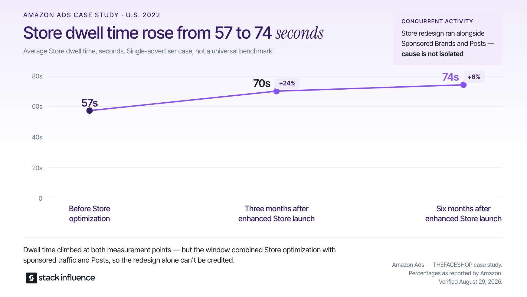
Amazon’s THEFACESHOP case study illustrates why behavior metrics belong beside sales. Average Store dwell time was 57 seconds before optimization, 70 seconds three months after launch of the enhanced Store, and 74 seconds after six months. Bounce rate also moved from 15% to 9% at the three-month point.
Amazon noted that the redesign ran alongside Sponsored Brands and Posts. This is one advertiser’s combined-program result, not proof that a particular tile, image, or design change caused the improvement.
The Cost of Copying Aesthetics Instead of Shopper Logic
A storefront can look similar to a successful example and still perform a completely different job. A premium video header may help explain an unfamiliar beauty routine, but it may slow down a repeat buyer who only needs the correct refill. A long list of gift ideas may help a deal creator, but it may confuse a technical audience seeking compatibility guidance.
Before transferring a pattern, run a five-question check:
- What shopper question does the original pattern answer?
- Does your catalog or recommendation set create the same question?
- Can your team keep the page, price claim, compatibility note, or deal list current?
- Is the path still clear on a mobile screen?
- Can you isolate traffic and outcomes well enough to judge the change?
Creator content presents another version of this risk. A brand should not assume that content can be copied into a Brand Store merely because it features the product. Usage rights, Amazon creative requirements, claim substantiation, and disclosure obligations still matter.
Stack Influence’s guide to Amazon-compliant UGC covers the content-use side, while the FTC states that creators should make material brand relationships obvious when recommending products.
Turning Storefront Inspiration Into Creator-Led Growth
A storefront becomes more valuable when the traffic source and landing experience tell the same story. Before launching creator partnerships, sellers should identify the Store page, collection, or ASIN destination that matches each campaign angle. That preparation also makes creator briefs more specific and subsequent attribution easier to interpret.
Stack Influence is a micro-influencer marketing platform built around gifted-first product seeding, vetted creator activation, campaign coordination, UGC generation, and completed-post accountability. The network includes roughly 600,000 vetted creators. The workflow is designed for ecommerce teams that want to move from product selection to creator participation and completed content without treating sourcing, shipping coordination, follow-up, and reporting as disconnected tasks.
For a storefront campaign, the operational sequence is straightforward:
- Choose the product, audience problem, and most relevant Amazon destination.
- Recruit creators whose normal content makes that recommendation credible.
- Seed the product and define the required content, disclosure, link, and usage-rights terms.
- Track creator completion and preserve each asset with its campaign metadata.
- Compare traffic quality and downstream outcomes by creator, angle, and destination.
- Use the strongest questions and content themes to improve Store navigation or licensed creative.
Sellers building a shortlist can use Stack Influence’s evidence-first guide to finding Amazon influencers. Teams ready to operationalize gifting can also review the product seeding guide and Stack Influence’s Amazon marketplace campaign workflow.
Build From the Job, Not the Screenshot
The most valuable Amazon storefront examples do not provide a design template. They show how a brand or creator turns a specific audience question into a useful path: finding the right system, choosing for an occasion, discovering complementary products, narrowing a niche, or returning for fresh recommendations.
Start by assigning your storefront one primary job. Study the two examples that solve the closest shopper problem, rebuild one decision path, and measure the result before adding more creative. Ecommerce sellers planning creator-led traffic can then evaluate whether a managed product-seeding workflow would help connect relevant creators, completed content, and the right Amazon destination.